Monday, December 8, 2008

Adding To The Shop

After a bit of research on archival quality printing, I've decided to add a couple more items to my shop today. I chose to go with a few of the more interesting Ttv photos and an unframed print of the Wishful Thinking illustration.

I wanted to make sure that any prints that were purchased from me would resist fading and look nice and sharp. I'm looking mostly for prints that are guaranteed for 70+ years. From the bit that I've read, it's important to print on acid free paper to prevent yellowing, and use pigmented/archival ink to resist fading. I found a few online options that look promising. It took me a bit of time to sniff out these printers, so I thought I'd share them here to save anyone conducting a similar search some time. Here are my findings:

http://www.mpix.com/
http://www.iprintfromhome.com/
http://www.imagekind.com/
http://finerworks.com/
http://www.giclee-factory.com

I have yet to use any of these printers so I can't vouch for them. If you have used any of these printers, I'd love to hear your thoughts.

I would really love to find a local printer to work with, I just am not sure where to start, especially if I'm not printing in bulk. If you're in the Indianapolis area, and you have any suggestions I'd love to hear them.

I'll be sure to post any findings and reviews once I've discovered a printer I like! Yay for learning about print! It's a wide wide world and it's SO not dead.

Saturday, December 6, 2008

The Results Are In!

My first attempt at printing with the gocco DEFINITELY didn't turn out as perfectly as I'd imagined it would, but isn't that the way with most first attempts? I set out to produce a set of prints to send out as Christmas cards and the experiment was full of lessons learned and questions I need to ask. Even though the prints didn't turn out as beautifully as I'd hoped they would, it was still fun to make. Here's a quick look at my process and my result.

First, I sketched up the initial design, scanned it in, then cleaned it up and played with colors in the computer. After a bit of playing, I finally ended up with this.I wish we had one of those little guys to take care of our shoveling for us! Least he has friends to make the work more fun.

Next I split the colors into 3 separate black and white compositions to use to burn the screens for the 3 different colors I wanted to print. I needed to take the compositions and have them printed on the laserjet printers at Kinkos because I needed carbon in the ink. Laserjet prints contain carbon, but my home inkjet printer does not. The first printout is what I used to burn the screen for the light blue color, the second for the light green, and the third to burn the screen for the dark green. I wasn't sure if there was too much detail in my illustration or not, so I was very curious to see if the detail of the shingles and the texture on the wall of the house would show up. I was pretty impressed by the results.

Insert blue filter then screen. The blue filter keeps the print from fusing to the screen when you burn it.Screw bulbs into housing then fit into top of the unit.Press down firmly on the front of the unit which will cause bulbs to flash and burn the screen. (I added a little flare to this photo for fun, cheesy I know, but hey this photo just didn't do the flash bulbing step justic)Here's a closeup of the middle screen. Check out the detail of the thin windowpanes and the ironwork. Pretty cool that the mesh is fine enough to pick all that up.

Once the screens were all burned it was time to print. I didn't have the color blue that I wanted, so I decided to mix my own. First lesson, I should have started with white, then added the blue. It was impossible to get it light enough once I had all that blue on my screen. Even after I printed all of my papers I still had TONS of ink left on the screen. All the ink was good for a nice even print though.Once you ink the screen, you lower the plastic sheet attached to the screen and fit the screen back into the unit facing the same way as when you burned it originally. Next step, place your paper on the rubber base, lower the lid and press. Then just lift the lid, the paper will stick to the screen, then you just peel it down gently and admire your print!
So, the colors couldn't really be further from what I'd originally envisioned. I decided to just roll with it though and deal with the brightness. Honestly, I dont mind the saturation, that crazy fluorescent green is kinda fun. I think if the blue was just a bit lighter and the dark green just a bit darker I would have been more ok with the overall look of the print.

I also learned that registering 3 colors with this model gocco is super difficult. Lots of mess-ups for sure.

The final point of frustration I had was knowing how much ink to flood the screen with. It seems to vary from color to color. I dont know if maybe the inks I have are different ages or if it has something to do with the pigment, but the dark green gave me ALL SORTS of agitation. Whenever I'd peel it off the screen I'd end up with certain areas with a heavier ink buildup than others. I was running low on the dark green ink, so I wasn't quite as generous with it as I was with the other two colors, and I wonder if that might be the culprit? If anyone has had similar experience with this kind of trouble, please share! Once I ran out I threw some black ink on the screen and it didn't give me that trouble... or maybe it did, but wasn't as noticeable because black is more opaque.

Does anyone have any tips on cleaning the screens? It seems impossible!

Overall, the experience was fun, and I cant WAIT to get more supplies for another project. I'm still unsure if I want to send these prints out as Christmas cards, or if I should just get the original illustration printed at kinkos or something to send out. I feel like the quality of this first run isn't necessarily what I want it to be to share with others, but then again is part of the charm in it's flaws? You can CERTAINLY tell they're hand-made. I'll have to live with them a bit longer to make my final decision.

So that's my first gocco experience in a nutshell! Hopefully there will be more to come.PS: I'd also recommend having furry helpers near by to give second opinions on the prints. Mylo was super helpful, especially when he laid on my feet to keep them extra warm.

Friday, December 5, 2008

Printing with the Gocco!!!

Oh Gocco! I knew we'd be a good fit together. Why did I discover you so late?!!!

I've been having so much fun playing with my new toy! After finally finishing a 3 color print design for our Christmas cards this year I've begun the printing process. I don't want to give too much away til it's finished. I just wanted to share a quick progress shot that Alex took.

This thing the Gocco and I have, it's love. So simple, such quality. I'm desperate to continue our love affair! Why has Riso stopped making supplies?! If anyone out there knows of alternative gocco supplies PLEASE let me know. If not, maybe you knows of a similar printing setup that ISN'T going extinct. That would be great too.

I guess the only thing to do, for now, is just to enjoy the time I have left with my beloved Gocco.

I cant wait to see how this first print project turns out with all 3 inks! I'll post when they're finished.

Thursday, December 4, 2008

My Etsy shop, La Grisette, is up and running!


I'm trying a little experiment. I've purchased many a hand crafted item off Etsy over the past couple of years, and I always thought to myself, "Someday, I should post a couple items for sale and see if there's any interest". Well, today was that someday. I've opened an Etsy shop online and listed my first item for sale. Sure it needs finesse (the look, the wording, the information), sure I need to add more items to sell (photography prints, illustrations, gocco prints, tshirts), but for now, it's a start. So without further ado, I present 'La Grisette' my little shop on the web. Just one framed illustration for sale now. More items to come.

Wednesday, December 3, 2008

New Basement Tees


The design and motion company I work for, The Basement, is in need of some company tees, so I put together this 3 color design. We wanted something other than just our logo slapped on a shirt, so I tried to integrate a bit of movement in the design to associate with all the motion work that we do. The plan is to print them on Alternative Apparel shirts (the perfect crew for men and organic scoop neck for women). We're hoping to get these printed and sent out to clients as holiday gifts, as well as for ourselves of course. I can't wait to see them finished, hopefully we can get them printed soon. Happy Wednesday!

Monday, November 24, 2008

The Exciting World of Split Toning!

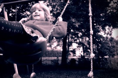
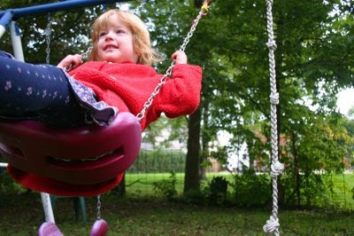
Ok, so I took this photo of my little niece, Margot, playing on the swing set earlier this fall. It wasn't the worst photo I took, but it was a gray, yucky day, so none of the colors really popped, and it didn't seem to evoke much emotion. I guess my eye never settles on one particular spot in the photo, so it's not super interesting. I wanted to try and do something to bring a bit more focus to the shot. She was in a very dreamy sort of mood that day, closing her eyes and just swinging and swinging, and I thought that the right kind of processing would allow me to bring out that mood more in the photo. Here's the original photo for you to compare.

I tried turning the photo black and white to see if it helped at all, but it still didn't help to draw the focus anywhere, if anything it made it worse by taking away her bright red sweatshirt. It just felt even more flat. I love the richer look of split toning so I thought I'd give it a try on this photo.

Here's a tutorial on how I achieved the look above.

Step 1: Add an adjustment layer that turns the image black and white


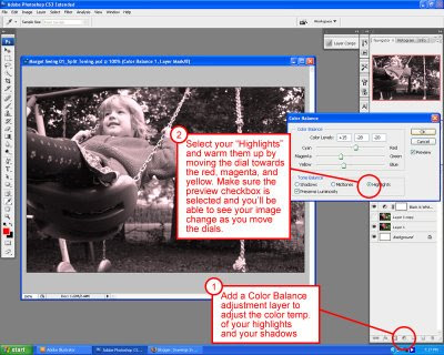
Step 2: Add a Color Balance adjustment layer, select highlights, and move the dials towards the red, magenta, and yellow. This will warm up the bright areas of the photo.


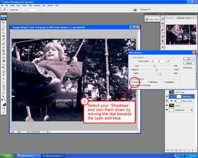
Step 3: With the Color Balance window still open, select shadows, and move the dials towards the red, magenta, and yellow. This will warm up the bright areas of the photo.


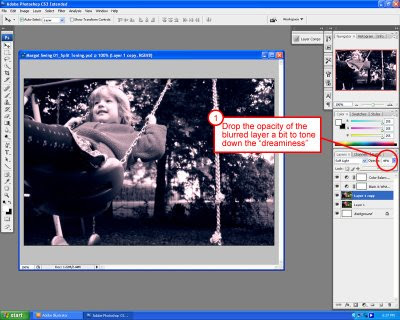
Step 4: To get the soft, dreamy look and punch up the contrast a bit. Duplicate the layer that your photo is on. Go to Filter > Blur > Lens blur then play with the threshold and radius to get nice bright spots that will highlight the sunny spots of your photo.


Step 5: Select the layer you've just blurred and change it's blending mode to "Soft Light"


Step 6: Now lower the opacity on the image so that the "dreaminess" isn't overpowering. (Unless that's what you're going for) In this case, I just wanted a subtle hint of it.


And now you should have a nice split tone dreamy effect on your image. I'd love to hear thoughts or other tips that you may have concerning this photo or tutorial.

Monday, October 27, 2008

The Basement's Crowd Surfing Game Launched!

Well, our flash game for KFC finally launched. This was the first flash game I personally had been involved with, and I am continuously amazed at the cool things that these code people can do! I was responsible for the illustrated assets, the character design, background, and menu design, then handed it off to the rest of the team to make it do all of the cool stuff. It was such a fun project and it's really cool to see it live. Hopefully this will lead to many more great game projects.

You can play the game at www.surfthecrowds.com

There are also links to it on www.kfc.com, www.kfcrocks.com and www.ign.com

Tuesday, October 14, 2008

Character Design

Two of the characters I designed for a national flash game we will soon be launching. More details to come. Rock on!

Friday, September 19, 2008

I think it's a sign


Here is a quick glimpse in to a neighborhood on the east side. The thing about this neighborhood that caught my eye the most was the signage. The style of the signs seemed to suggest that the town must have boomed in the 50's but now they've all experienced a sort of urban decay. Perfect for a little TtV photo shoot.

Wednesday, September 17, 2008

Mustang Sally, through the viewfinder

Somehow this TtV thing seems to capture the late summer warmth on a cherry red mustang far more eloquently than my dslr on its own. Working in a field where everything is post produced, there's something really freeing about creating a whole mood in an image before it ever reaches my photo editing software. No grunge masks, no massive exposure or color corrections, just a slight tweak of the curves to pop the darks and viola, an unsightly used car lot in a small town can feel completely warm and nostalgic. I posted more small town USA, TtV style, on my Flickr site.

Photo Week: Auto-Settings

This week Photo Week is inspired by our camera's Auto-Settings

Share your work with Steph as she hosts this week's challenge.

Monday - Landscape
It's a secret little landscape.

Tuesday - Macro

Alex was driving me around Lebanon to shoot some photos of our small TtV style and when I got back in the car this little guy was sitting on my door. He flew off onto a fence where I shot the rest of the photos.

Wednesday - Portrait

My sweet niece Sylvia Q.

Thursday - Action

My other sweet niece Margot being pushed on the swing by Uncle Alex.

Friday - Nighttime

Oh Gocco!

This little device is the raddest thing I've seen in a long time! I've been lusting after it lately and imagining all the cool stuff I could do with it. It's not sold here in the US anymore, so it's become a rare-ish sort of item in these parts. How sad that something THIS fun should be largely unavailable to the general art loving public here in the US. Some day, hopefully, some lucky owner of a Gocco will tire of it's charms, or perhaps upgrade to one of the larger units leaving it available and in search of a new loving home. Some day...

Saturday, September 13, 2008

TtV Experiment

Last night I grabbed an old piece of cardboard and some electrical tape to construct my glare blocking tunnel for the TtV experiment. It didn't take long, I suppose I could have tried a little harder to make it look nice, but I was so anxious to get to using it I really didn't care about the aesthetics of the tube.

My contraption, though strange and ugly, worked great!

I took a couple test photos in the living room last night to test it out, then a couple more outside this morning. I can see some definite potential for cool photos. I'm curious if the length of the tube has anything to do with the way the edges of the photo will bubble. (why didn't I pay more attention in optical physics) Well, I'm off, I've got lots of experimenting to do!

The top of the camera flips up and you look down through the viewfinder


Here's my ugly little cardboard tube on the camera. I just stick the lens of my DSLR in the top of the tube and snap away.

Friday, September 12, 2008

Hello Beautiful!

A week or so ago I won an old twin lens Kodak Duaflex camera on ebay. I just think they're super cool looking and I thought it would be something interesting to have on a shelf in the living room. Aside from it's aesthetic value, I of course thought that it would be fun to load it up with film and shoot some photos with it from time to time.

As soon as the package arrived, I opened the box, pulled out my new (old) toy and began to wander around the house. As I gazed down through the top of the camera through the viewfinder there was something really cool about what I saw. The same things I see EVERY day somehow looked different and a little more interesting. I thought little more about actually using the camera other than to show Alex the Duaflex when he got home. Just as I did, he held the camera at mid torso level and looked down through the top of the camera and commented on how neat things looked through the viewfinder.

Apparently we're not the only ones who think that a little magic happens when you look down through the veiwfinder of these old cameras. I recently found a post about TtV (Through the Viewfinder) Apparently there's a whole community of people who rig up their digital SLR cameras to take photos down through cameras like my duaflex. Here's a great how-to article that explains the process. I can't wait til tomorrow when I will rig up my own duaflex for some TtV fun!

Friday, August 29, 2008

Blue Friday

Happy Blue Friday Everyone!!! I decided to play with my idea of Friday in addition to the color blue for this post. The long weekend is here which means time to put my feet up, enjoy a cold one, and spend some time in the lovely outdoors! Hooray for Fridays!

I had so much fun sharing photos with everyone during color week. I loved seeing all of the daily photo posts and reading all of the comments. Everyone really seemed to enjoy the project as well. I think that the color topic was a fun, easy way to get us back in the habit of carrying our cameras around with us. Nice work everyone, I was most impressed.

For our next task, I had an idea. What if we use the entire week to complete our exercise. This way, you can post photos as you take them throughout the week, but if you would like to spend more time on a photograph, there's not the investment of spending that kind of time every day. By the end of the week we should have a set of photos that reflect the theme, but whether you decide to take them each day or all in one day doesn't matter.

I'm going to 'tag' Steph as our next Photo Project host. See her blog for info on the next project and the list of participants.

Check out Steph's Blog for the next Photo Project

Thursday, August 28, 2008

Thursday - Green

The rest of my greens are up here on my flickr site.

Well, I only got a few greens before our battery died! booo! I was so excited, Alex and I were gonna go on a bike ride and capture some of the green country around us. Oh well, the ride was still nice, even if we don't have any photos from it. Luckily we got a few in the back yard.

Tomorrow is our last exercise for color week!

Blue will be a nice color to end on. I'm super impressed with how everyone has kept with this challenge this week. It's kind of a lot to do every day! Kudos to all who've participated. I really have enjoyed seeing everyone's awesome photos and reading all of the comments.

Wednesday, August 27, 2008

Wednesday - Yellow


The rest of my yellow photos are posted here on my flickr site.

I loved seeing the honey bee's legs up close once I looked through my photos. It was such a brief moment that he was buzzing around the sunflower that I hardly noticed it at first. As you can see, my day involved a bit of laundry out to dry and some pretty yellow flowers. Photo project proves to be the most relaxing part of my day yet again. :)

Again, lovely photos everyone! I just adore the insight into the individual personal lives of everyone participating. The different perspectives, the various subject matter, wonderful all around! Tomorrow Greeeeeeeeeeeen!

Tuesday, August 26, 2008

Color Week Continues! Tuesday - Orange

You can see the complete set here at my flickr site.

I totally ignored my better judgment to wait until the sun was at a more agreeable angle today and went out over my lunch break to grab some orange photos. (I know the truck is more 'rust' than orange, but I just had to share. What a strange little town!)

Nice job with the orange photos everyone! Tomorrow, Yellow Wednesday!

Alex
Ashley
Beth
Cambrie
Greg
Jen
Justin
Nicole
Sara
Scott
Shelly
Steph
Sue